


Roles
UX/UI Designer
UX Researcher
Deliverables
Web-based 3D modeling app
M-web port
Timeline
4 Months
Tools
Figma
Adobe Photoshop
Zoom
MidJourney
Background
With the rise of e-commerce, consumers are increasingly turning to online platforms to purchase furniture. However, a major challenge remains, shoppers often struggle to visualize how a piece of furniture will look and fit in their space. To address this, many retailers are integrating 3D modeling technology that allows users to interact with furniture in a more immersive way.
Problem Solution
To solve this, the project focuses on creating a simple, intuitive UI for exploring 3D furniture models. Many existing tools are hard to use, with clunky navigation and confusing controls, which leads to frustration and abandoned purchases. This design aims to make it easy for users to view furniture details, adjust angles, and interact with products without technical barriers.
Project/Business Goals
Design an intuitive 3D navigation system for seamless furniture exploration.
Help users make confident purchase decisions, reducing return rates.
Encourage interactive exploration to improve customer retention.
Create an inclusive, user-friendly interface for all skill levels.
Develop a responsive, fast-loading UI for all devices.
Empower businesses with better product visualization tools.
Discover
When I joined Nestingale, a working version of the product already existed. While functional, it lacked polish. User interviews conducted by the team prior to my arrival highlighted key issues such as confusing 3D navigation, unclear visual hierarchy, and frustration around basic object interactions. I built on these insights with additional competitive analysis to inform the redesign.
Competitive Analysis
To inform the redesign of the 3D furniture app, I conducted a competitive analysis of four leading platforms: Homestyler, Coohom, magicplan, and Planner 5D. This analysis helped identify patterns in navigation, feature accessibility, and overall usability across the market. It also revealed opportunities to streamline interactions, reduce user effort, and differentiate the product with a simpler, more shopping-focused experience.
Key Features
Room creation with structural elements (walls, doors, windows)
Manual customization of ceilings and walls
Autostyler tool for room presets
Model Library for furnishing rooms
Pain Points
Room creation with structural elements (walls, doors, windows)
Manual customization of ceilings and walls
Autostyler tool for room presets
Model Library for furnishing rooms
Takeaway
Reduce cognitive load by simplifying flows and making key actions (e.g., placing furniture) achievable within one or two intuitive steps.
Key Features
Detailed room and wall structuring tools
Public Library and Materials & Components for customization
AI Templates for automated room styling
High-end rendering and user account management
Pain Points
Similar to Homestyler, key actions require multiple clicks
Some features are paywalled, limiting testing and discovery
AI Templates are visually superior but feel somewhat hidden in the interface
Takeaway
Surface powerful features like AI Templates earlier in the journey and prioritize speed + visual feedback in styling tools.

Key Features
Room scanning via camera or manual layout
Object insertion with size controls
Supports annotations (photos, notes)
Pain Points
Focused more on room documentation than visual design or product interaction
Object placement lacks visual richness or real-time feedback
Limited 3D model fidelity and furniture browsing
Takeaway
Incorporate visual cues and real-time rendering for object placement to boost engagement and reduce friction.

Key Features
Unique budgeting feature tied to project design
Room construction with shape tools and L-shaped guides
Extensive Interior & Exterior libraries (e.g., furniture, patio, landscaping)
Pain Points
UI lacks modern polish and feels outdated in places
3D navigation is less fluid, especially when inspecting individual objects
Editing tools are functional but less discoverable
Takeaway
Modernize UI patterns and improve object-focused controls (zoom, rotate, highlight) to support product evaluation use cases.
Discover: User Interviews
In addition to reviewing existing interview data, I analyzed user feedback to uncover key pain points interior designers faced with the 3D builder.
While immersive design was appealing, users found the experience frustrating due to clunky 3D interactions, awkward 2D/3D transitions, and slow workflows for presenting product options.
These insights highlighted the need for a smoother, more intuitive tool tailored to interior designers.


"Switching between 2D and 3D views breaks my creative flow."
"I wish placing and resizing furniture in 3D didn’t feel so clunky."
"Most 3D tools feel like they’re built for architects, not interior designers."
"I want to show clients multiple product options, but swapping them takes forever."
Click on images to expand
Define: Affinity Mapping
To synthesize user feedback, I created an affinity map organized into five key categories: 3D Interaction & Navigation, Workflow & Efficiency, Client Presentation Needs, Tool Complexity, and Product Customization. This helped reveal recurring pain points and usability gaps across the design process. The insights directly informed the feature selection and guided key decisions throughout the redesign.
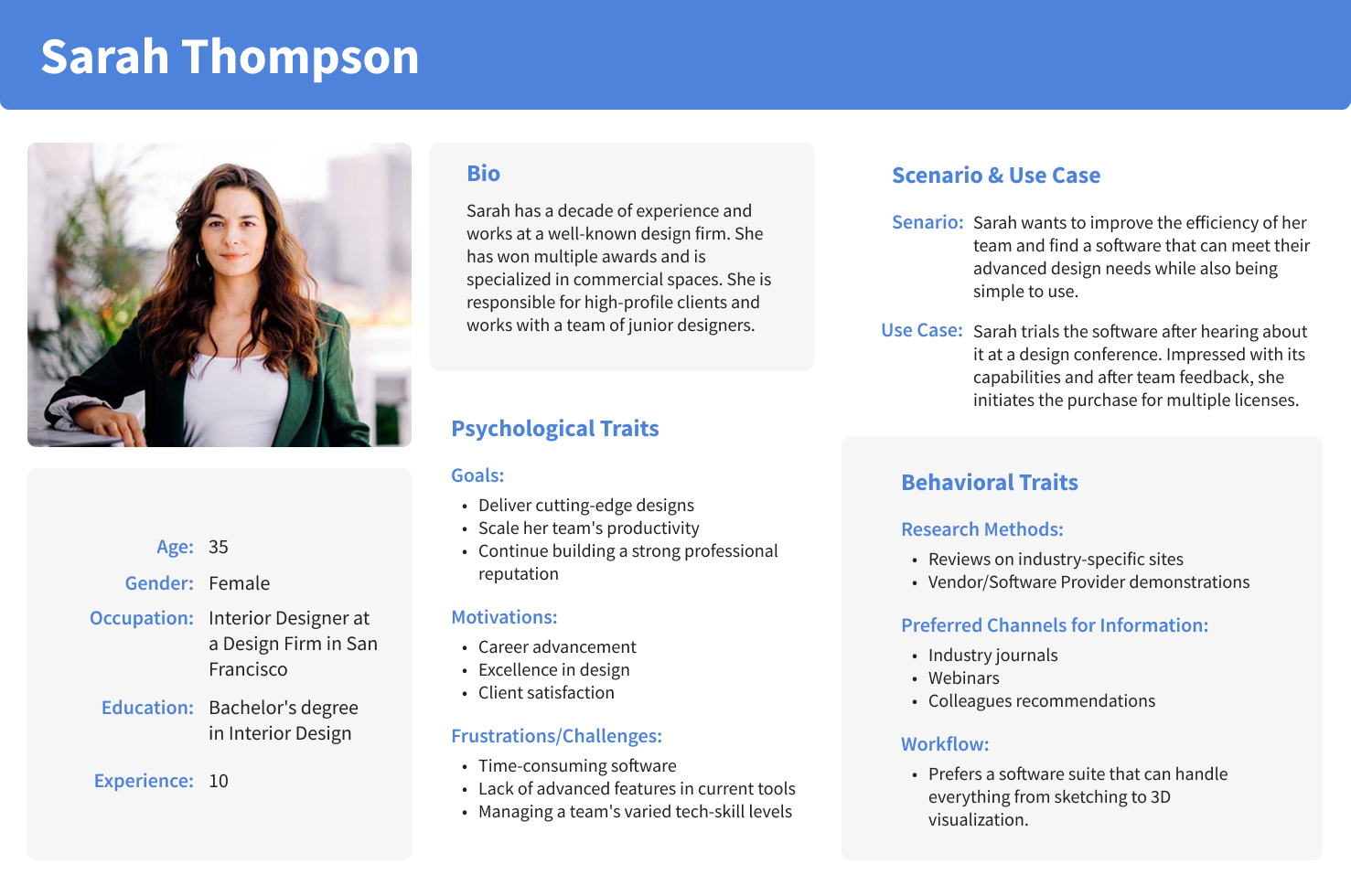
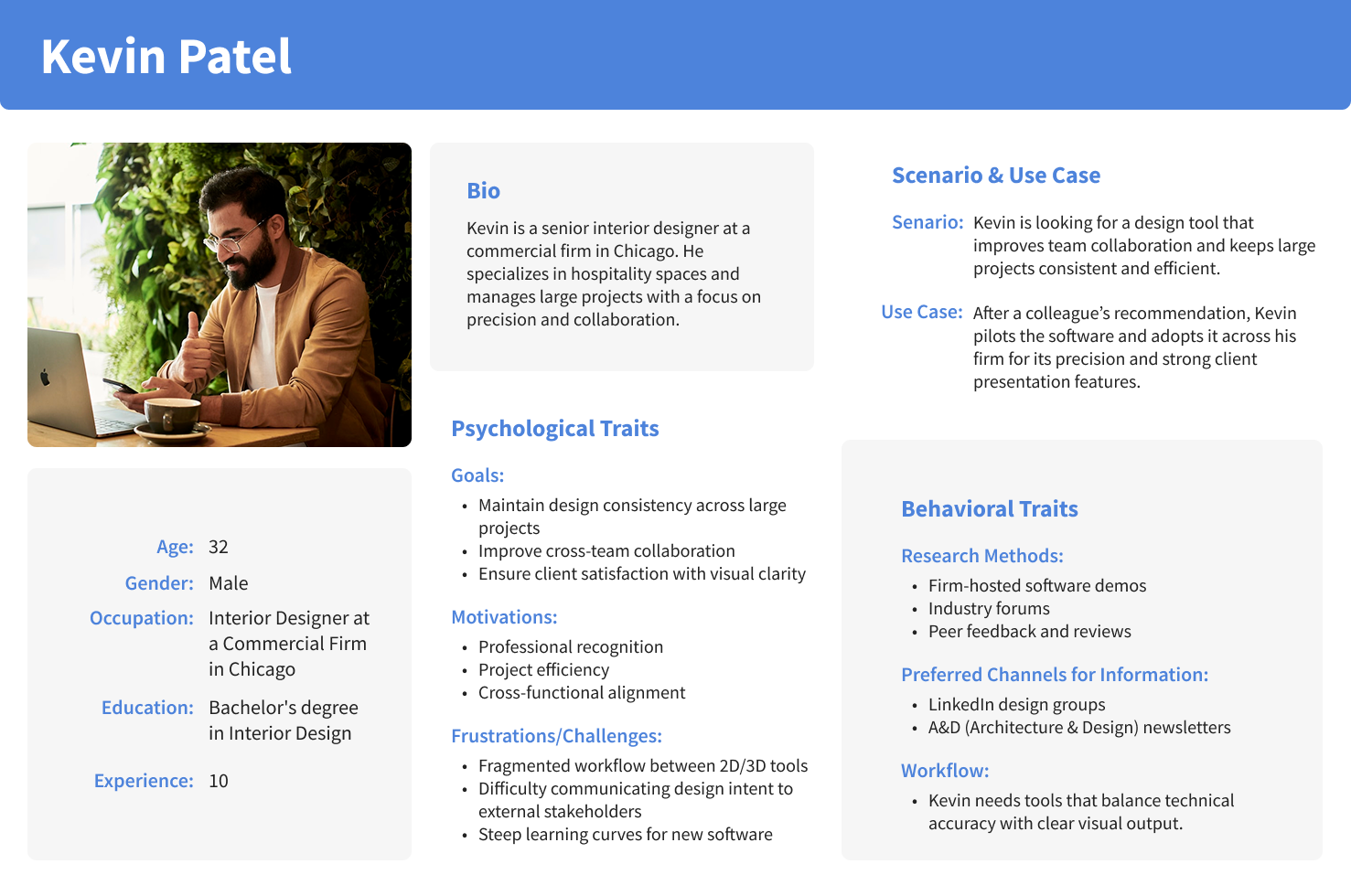
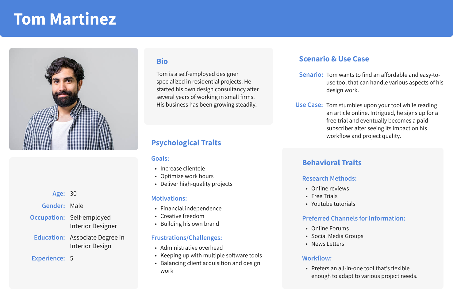
Define: User Persona
Based on user research, I identified three key user types for the 2D/3D Builder:
Professional Interior Designers
Self-Employed Designers
Beginner/Aspiring Designers
Each group brings unique needs, workflows, and pain points to the platform. To better understand and design for them, I created personas that reflect their motivations, behaviors, and challenges across experience levels.
Professional Interior Designers
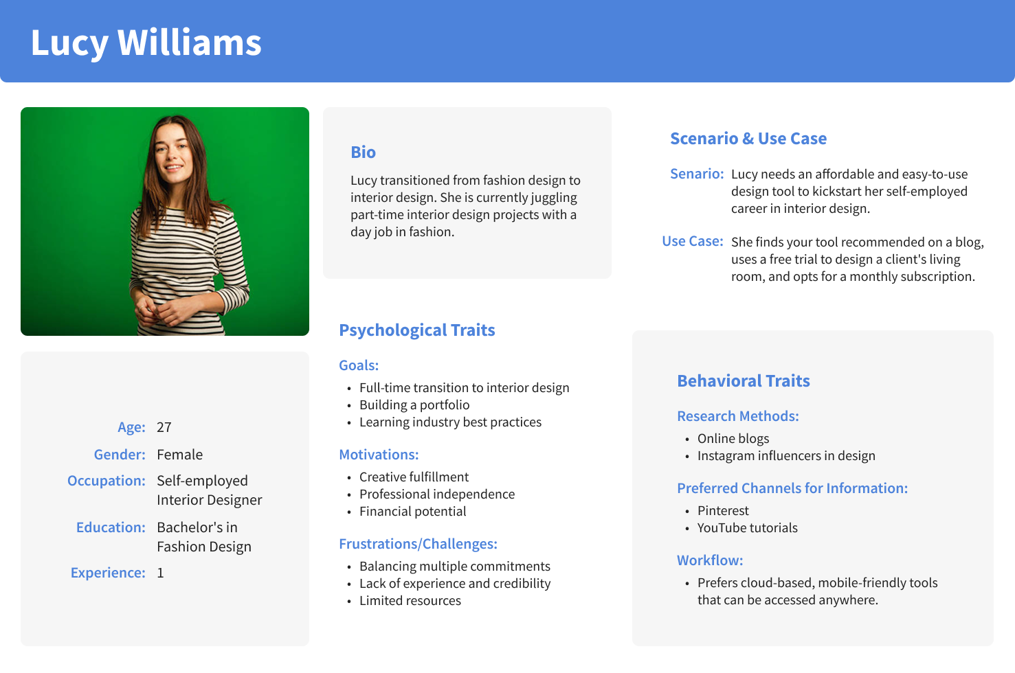
Self-Employed Interior Designers
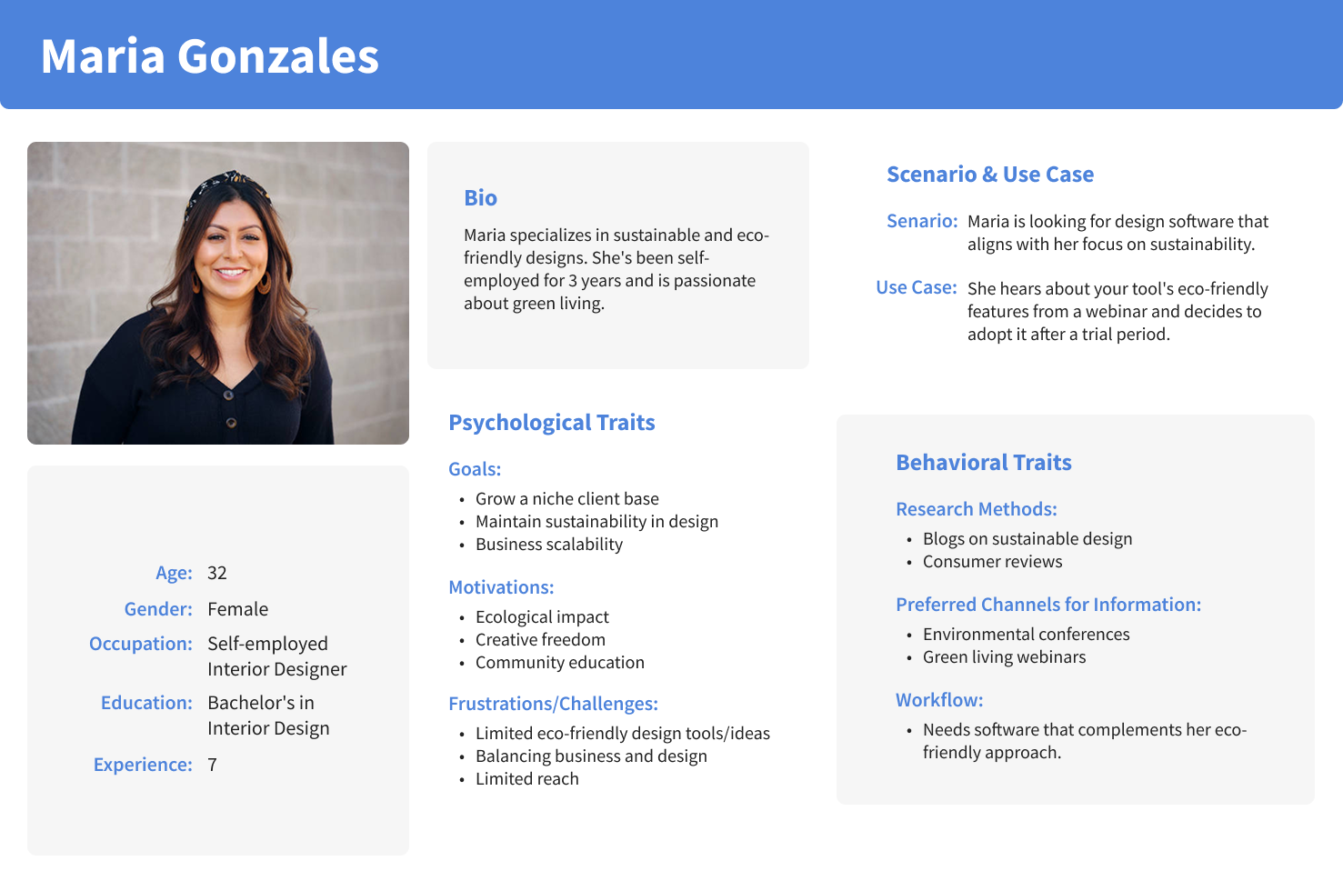
Click on images to expand
Beginner/Aspiring Interior Designer
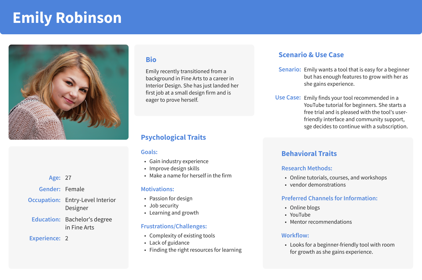
Click on images to expand
Ideate: Brainstorming
Guided by insights from affinity mapping, I brainstormed features across four key areas:
Navigation & Interaction Features
Editing & Workflow Tools
Client Presentation / Collaboration Features
Product & Assets Features
The goal was to streamline the design experience for interior designers while enhancing client collaboration. I focused on features that balanced ease of use with creative flexibility from intuitive camera controls and a toggleable 2D/3D viewer, to immersive preview modes, curated room sets, and interactive client feedback tools. This structured ideation laid the foundation for a focused and impactful redesign.
Ideate: Site-Map
I also created a sitemap which outlines the core structure of the 3D Builder app. It organizes key features like project editing, client collaboration, and asset management into a clear, user-friendly hierarchy to support a seamless design workflow.
Click on images to expand
Ideate: User Flow/Task Flow
To visualize how users interact with key features, I mapped out task flows for building a new room and switching between 2D and 3D views. These flows highlight the step-by-step journey users take, helping ensure the interface supports a smooth and intuitive experience.
Click on images to expand
Ideate: Low-Fidelity Wireframes
To explore layout and functionality early in the design process, I created low-fidelity wireframes that focused on core user flows such as room editing, navigation, and client review. These wireframes helped validate content structure and interaction patterns before moving into high-fidelity UI design.
Click on images to expand

Ideate: Mid-Fidelity Wireframes
I created a series of mid-fidelity wireframes to refine layout and interaction details, enabling quick user testing and feedback without the distraction of final visuals.
Click on images to expand
Ideate: Preliminary Usability Testing & Results
After creating the mid-fidelity prototype, I conducted usability testing sessions with target users to identify gaps in clarity, layout, and interaction.
The feedback surfaced both UI and UX pain points ranging from visual overcrowding to unclear starting points. These quotes reflect the most common themes and directly influenced the next round of design improvements.
“It looks a little too plain… like everything’s just stuck together with no space to breathe.”
“This bottom section is doing too much; it clutters the view.”
“I couldn’t even find the save button at first… it’s too hidden.”
“I didn’t get a clear sense of what I’m supposed to do when I open it.”
UX
“I wasn’t sure where to begin I thought I needed to click on a wall.”
“It’d be super helpful to see the total cost as I add things.”
I just started clicking around, but it wasn’t clear where to begin.”
UI
Ideate: Low-Fidelity Wireframes V2
Based on insights from preliminary usability testing, I created a second round of low-fidelity wireframes to address layout clarity, improve hierarchy, and better guide users through core tasks. This version focused on simplifying the interface and refining key interactions before moving into high-fidelity design.
Click on images to expand
Ideate: Typography
I chose Nunito for its clean, rounded style that supports both clarity and approachability.
The type system includes 32, 24, and 20px for headings (used in bold or regular), 18 and 14px for body text, and 11px bold all-caps for UI labels.
This scale ensures a clear visual hierarchy across headers, content, and interface elements, while maintaining consistency and accessibility.
Ideate: Mid-Fidelity Wireframes (Desktop)
The mid-fidelity wireframes refined layout, hierarchy, and interaction details, allowing me to test structure and usability while still iterating quickly before visual design decisions were finalized.
Click on images to expand
Ideate: Brand Values & Visual Design
The visual design was guided by core brand values such as Clarity, Creativity, Efficiency, Accessibility, and Trust; to create an interface that feels modern, intuitive, and empowering for designers.
I selected a clean and approachable color palette, crafted a simple yet memorable logo, and used Nunito as the primary typeface to establish a friendly and readable hierarchy.
Together, these elements create a cohesive visual system that supports both usability and inspiration.
Brand Values
Clarity
Creativity
Efficiency
Accessibility
Trust
Logo
Color Palette
Typography
Click on images to expand
Prototype: High-Fedility Wireframes
High-fidelity mockups brought the final UI to life with polished visuals, consistent styling, and detailed interactions that aligned with both user needs and the brand’s identity.
Next Steps: Test & Iterate!
Moving forward, I plan to conduct additional usability testing on the high-fidelity prototype, gather feedback from interior designers, and iterate on the design to improve functionality, performance, and overall user experience