

Roles
UX/UI Designer
UX Researcher
Deliverables
Mobile first web app
Desktop port
Interaction Design
Timeline
4 Months
Tools
Figma
Adobe Photoshop
Zoom
Background
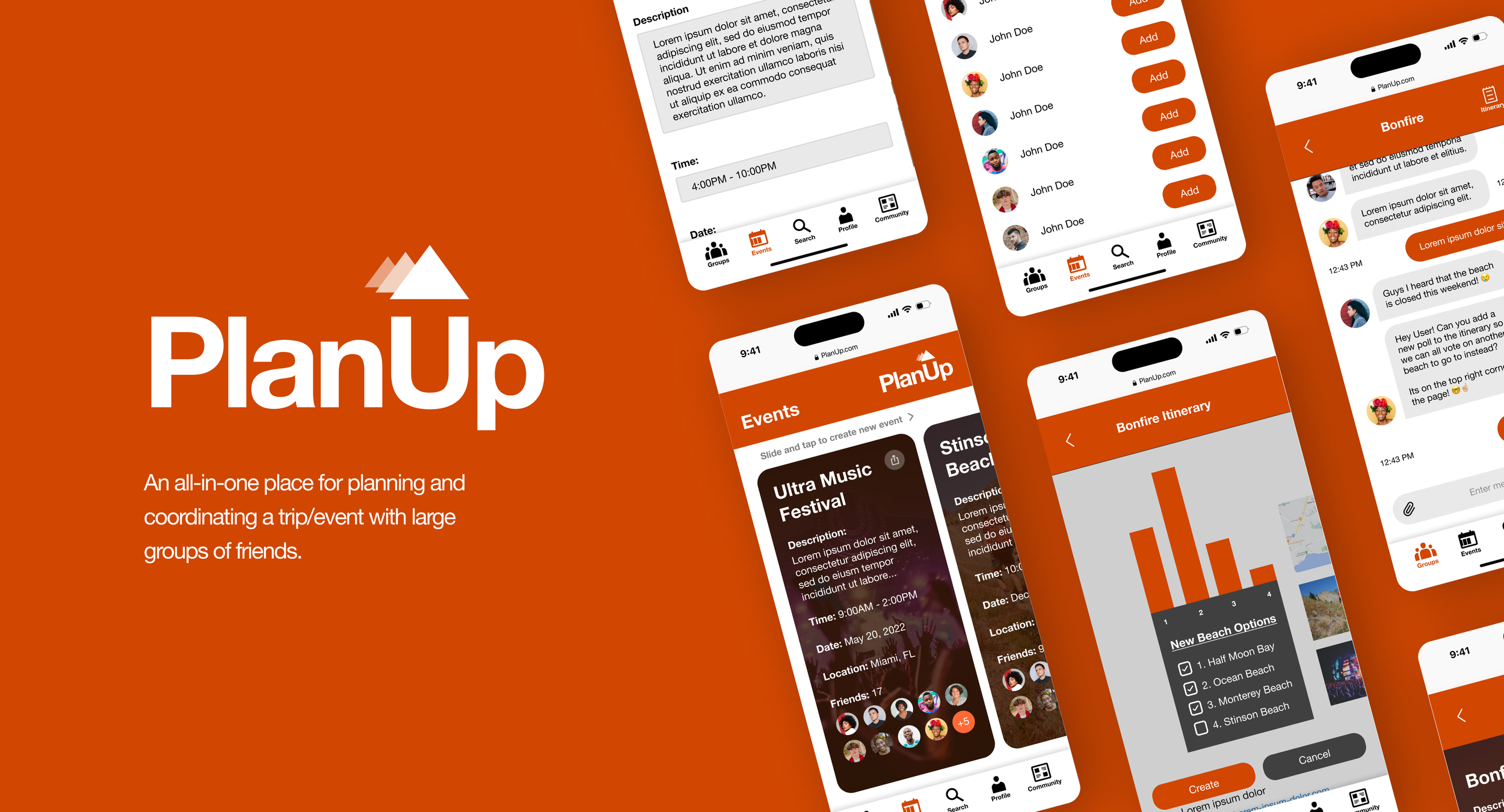
Planning a trip or an event can sometimes be a daunting task. Many people tend to need help with picking out a time, location, date, activities, booking flights/hotels, and just generally coordinating an event with a group of people.
To alleviate this people use an array of services like Facebook (that many people don't really use anymore) or try to communicate via social media/messaging apps (which can rarely be a streamlined process if all participants use different services). As a result, the whole process of planning a trip/event feels cumbersome.
Problem Solution
Through an intensive research process, I discovered that there is a need for a product to simplify, organize, and coordinate the whole process of planning a trip/event in one place instead of having to use multiple services which can be tiring and cumbersome.
Project/Business Goals
Build an MVP of a web app that allows users to plan and execute trips/events with friends.
Attract a large number of active and outgoing users with a high return rate.
Once a large enough userbase has been attracted, collect data on users (with their permission) to build a report on what are their interests and behaviors, and what type of products, or services they normally use.
Once data has been collected and analyzed, monetize data to generate revenue.
Design Process
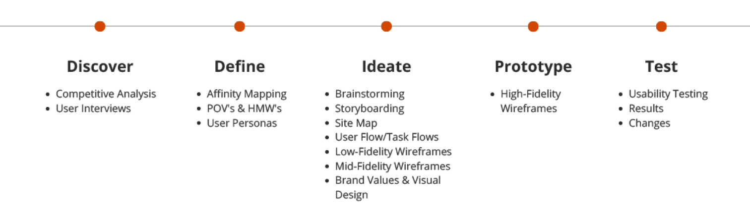
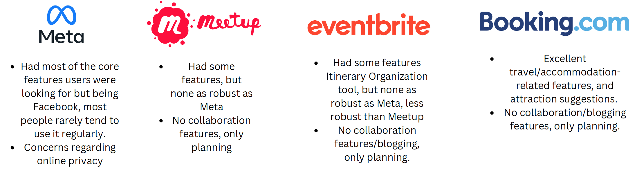
Discover: Competitive Analysis
For Competitive Analysis, I decided to analyze 4 main competitors and their services
Discover: User Interviews
For User interviews, I mainly focused on how users plan their trips, what kind of people they invite, past experiences,
considerations they take into account when planning, collaboration, and what type of tools/methods they use when planning.
Click on images to expand
Click on images to expand
Define: Affinity Mapping
The collected research found several themes and insights on the users I interviewed.
Motivations: To create good memories and rest/relaxation.
Planning Process included
Plan ahead
Budgeting and finding deals were critical for younger users
Used Travel Agencies for travel/accommodation
Changing plans and setbacks seem to be common among users
Metrics for Invitation
Shared interest was the deciding factor for the invitation
Planning Structure: Preferred flexible over structured
Group size: Medium to large groups of people (20+)
Pain points included
Lack of robust communication/coordination methods
Finding a good location
Inaccurate Trip data
Preferred form of communication included
Group chats
Call/Text
Social Media
Define: POV’s and HMW’s
From the Affinity mapping, I created one “Point of View” question and three “How Might We” questions, to help craft my User Personas.
POV 1: I'd like to explore ways to help young people, struggling with organization to plan well-organized and easy-to-manage trips/events because their trip/event itinerary tends to change and morph constantly.
HMW 1: How might we help people who experience frequent changes when planning trips to better manage/organize their itinerary?
HMW 2: How might we help these people quickly find a new solution when changes to trip itineraries arise?
HMW 3: How might we help the user to communicate changes on itinerary plans to other people in their group?
Define: User Personas
Finally, after all the User research, Affinity Mapping, POV’s and HMW’s I crafted two Personas to better help me to emphasize with my Users. The first persona is an outdoorsy and adventurous young professional, and the second persona is a younger individual who loves to travel frequently with friends but is more budget-conscious.
Click on images to expand
Click on images to expand
Click on images to expand
Ideate: Brainstorming
After all the extensive research I began to collect the data and begin brainstorming solutions for user struggles with the current tools available. A few features I came up with during this process were:
”Groups” A built-in group chat feature.
“Itinerary View” Allows users to organize ideas they discussed in the group chat.
“Smart Suggestions” allows users to find interesting new places to see.
Ideate: Storyboarding
To better ideate the user needs visually, I created a storyboard for each of the features I created while brainstorming solutions.
Click on images to expand
Click on images to expand
Ideate: Site-Map
After a Card Sort exercise, I created a basic site map of the website. (Note this specific layout changed somewhat during the design process)
Groups
Create Event
User Profile
Search
Community
About Us
Click on images to expand
Ideate: User Flow/Task-Flows
I created a User Flow (on the next slide) and a corresponding task flow for an optimal path the user might take while navigating the website.
Due to time constraints, not all features were able to be implemented in the final design, however, I still went ahead and created them so that they could be implemented at a later date or on a second sprint.
Click on images to expand
Ideate: Low-Fidelity Wireframes
With all the research, features, and navigation planned out; I began brainstorming ideas for how the website would look on a low level.
After several sessions of brainstorming (and a lot of recycled paper) I decided to go with a contemporary card-based layout that shows all relevant information on a single tile.
Click on images to expand

Click on images to expand
Ideate: Mid-Fidelity Wireframes (Mobile)
During this process, I learned that what was drawn on paper does not always translate too well into real life.
Also, further brainstorming made me realize that it would be more intuitive for the user if the mobile port of the website was designed to function more like an app with a bottom navigation bar all within the mobile browser.
Ideate: Mid-Fidelity Wireframes (Desktop)
The desktop view however followed a more traditional layout. Albeit more simplified whose elements were highly similar to the mobile port to make the user feel more comfortable when transitioning from mobile to desktop.
Click on images to expand
Ideate: Brand Values & Visual Design
With all the research, features, and navigation planned out; I began brainstorming ideas for how the website would look on a low level.
After several sessions of brainstorming (and a lot of recycled paper) I decided to go with a contemporary card-based layout that shows all relevant information on a single tile.
Brand Values
Teamwork
Friendship
Adventure
Leadership
Resourcefulness
Logo
Color Palette
Typography
Login/Sign Up
Click on images to expand
Prototype: High-Fedility Wireframes
Wrapping everything together, I created three flows.
- Login/Sign Up
- Create New Event
- Groupchat/Itinerary
Create New Event
Click on images to expand
Groupchat/Itinerary
Test: Usability Testing
After designing the High-fidelity prototype, I decided to conduct a usability test.
It consisted of 5 users (one user from my initial user research)
All three flows of the mobile port were tested.
Consisting of video conference with Figma prototyping feature.
The research goals were to:
Evaluate if the prototype is easy to use and user-friendly by observing the user while they complete the task user flow.
Understand the user’s impression of the prototype, how they navigate the site, and how they use site features to accomplish tasks.
Uncover any difficulties or obstructions the user encounters while using the prototype.
Test: Results
The First Flow had only minor problems, primarily dealing with users having trouble identifying the "sign-up" icon on the bottom and a bland login background UI.
The Second Flow was where most of the issues arose.
Missing Date box for creating new event.
No way to share events with others
Navigation in create new event for "Add Friends", and "Create/Link to existing group chat" were too confusing for users and had to be reworked.
The Third Flow was very well received and had only one very minor issue (a redundant icon that was causing confusion among some testers).
Click on images to expand
Test: Changes
For the first flow, the source of the problem in finding the sign-up page stemmed from a cluttered login experience (the Google/Facebook/Twitter signup). Therefore, they were removed to make the sign-up icon on the bottom more apparent.
Also, a background image was added to the login/sign-up pages to make them look more aesthetically pleasing.

Click on images to expand
For the second flow
- A date box was added to the create an event pages.
- A share icon was added to the cards to allow the user to share events via a link to other users.
- The navigation for Add Friends and Create/Link to group chat was simplified by breaking down the process into more steps. Though this did make the create new event process a bit longer, it was a worthwhile trade-off as it made the create new event process far simpler.
For the third flow, had the hamburger icon in the itinerary view removed as it was causing some confusion as too its purpose among testers, other than that this view was largely untouched.
Next Steps: Lessons Learned
This entire process was a huge learning experience. I learned that:
An initial plan/hypothesis can and will change as you gather more data through research.
Research can be tedious, but remember that it can mean the difference between a useful and flawed product.
Breaking down the process into tiny steps can help you iron out the finer details.
Be ready to iterate and reiterate any process step if you realize something doesn't work out.
Capture your problems as early as possible (let flow two be a testament to this).
Fancier doesn't always mean better (Functionality First).
Next Steps: Test & Iterate!
As we already know, design is an iterative process. Due to time constraints, I was not able to achieve all the flows I wanted to implement (Smart Search, User Profile, Community, etc...) and had to focus on creating a minimum viable product. So the next steps would be...
Implement a Smart Search feature for users to find flights, hotels, and attractions.
Create User Profile tab for users to add/change personal info (name, profile picture, and other basic info).
Further research and Implement a Community page for users to share photos and write blogs and reviews of attractions.
Continue to research and design, test, and iterate through the process.